2023
Storytelling though Data: Where on earth?
Data Visualization & Visual Storytelling
Skills
Sketching, Data Visualization, Concept Development, Research
Tools
Adobe Illustrator, Tableau

Goal
Create an information graphic that tells a story about a city important to you using data visualization. The data graphics should work together to communicate the story or message in a clear, truthful, and authentic manner.
Project Overview
For my project topic, I chose to focus on Balanga, Philippines which is a city that continues to experience rapid development and provides many opportunities to those who live in neighbouring municipalities. My goal was to design an infographic that not only presents data, but also communicates Balanga’s identity, development, and opportunities in a way that feels meaningful and accessible. The process of this project included concept development, research, synthesis, sketching data visualizations, and peer critique sessions.
Process
Brainstorming & Sketching
I began by exploring what aspects of Balanga’s growth felt most important to communicate. Through early sketches, conversations with family members, and desk research, I identified themes around education, employment, and public services.


In my developing understanding of the city and gathering of qualitative and quantitative data, I was then able to sketch out some data visualizations and understand which visual formats best supported the narrative. The feedback I received during this stage guided me toward a more cohesive visual direction and ensured each graphic contributed to the larger story of Balanga’s development.


Final Poster
After refining the sketches, I digitized the visualizations and used Tableau to accurately represent the quantitative data. My design decisions focused on clarity, hierarchy, and visual cohesion so viewers could quickly understand the city’s growth patterns.
The final poster brings together multiple data stories into one unified visual narrative, showing how Balanga’s institutions, student migration, workforce distribution, and historical milestones collectively shape its rapid urbanization.

Data Infographic Breakdown
Services and Institutions Illustrative Diagram
To introduce Balanga, this illustrative diagram provides context to what the city looks like today in regard to its different services and institutions.

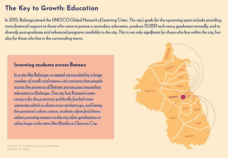
Student Migration Flow Map
This flow diagram illustrates the student migration the city experiences as many university students come from neighbouring municipalities within the province.
Student Enrolment in post-secondary Institutions Bubble Chart
This bubble chart highlights the variety of universities and number of students studying in the city’s public and private post-secondary institutions.

Working Population Radar chart
This radar chart displays Balanga’s working population throughout different industries in 2015 with a large spike in service and sales workers which correlates to the rapid development of the city.

History & journey towards urbanization Timeline
This timeline connects historical events to Balanga’s growth, helping viewers understand how national context shapes local development.

Reflection
Working on this project taught me how powerful data can be when paired with thoughtful visual storytelling. By focusing on Balanga, I was able to combine personal insight with design strategy, creating an infographic that reflects both the city’s growth and my own perspective. This experience helped me refine how I structure information, choose visual formats, and build narratives that resonate with viewers.